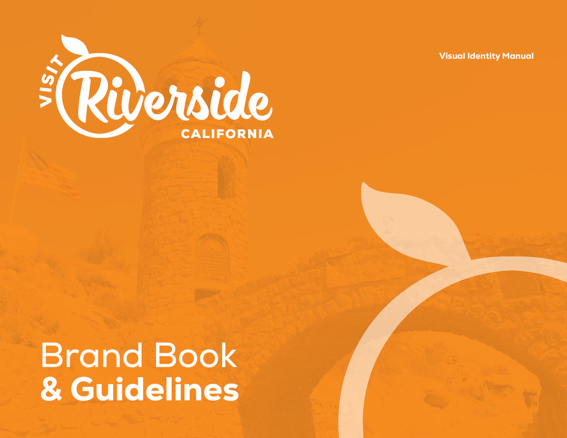
Visit Riverside sought a refreshed brand identity that could authentically represent the city’s cultural layers, historic landmarks, creative talent, and welcoming spirit. The existing materials no longer captured the vibrancy, diversity, and emotional resonance that define the destination, and there was a clear need for a unified system that could support tourism marketing, civic pride, and community storytelling across platforms.
My role was to help create a brand system that felt modern, flexible, inclusive, and emotionally grounded. This included developing a refreshed visual identity, defining a narrative framework, designing a color and typography system, producing brand patterns, and shaping a campaign direction anchored in the idea that “All Sides Shine.” I contributed to creative direction, layout design, copywriting, and the development of a brand book that could guide future communications with clarity and purpose.
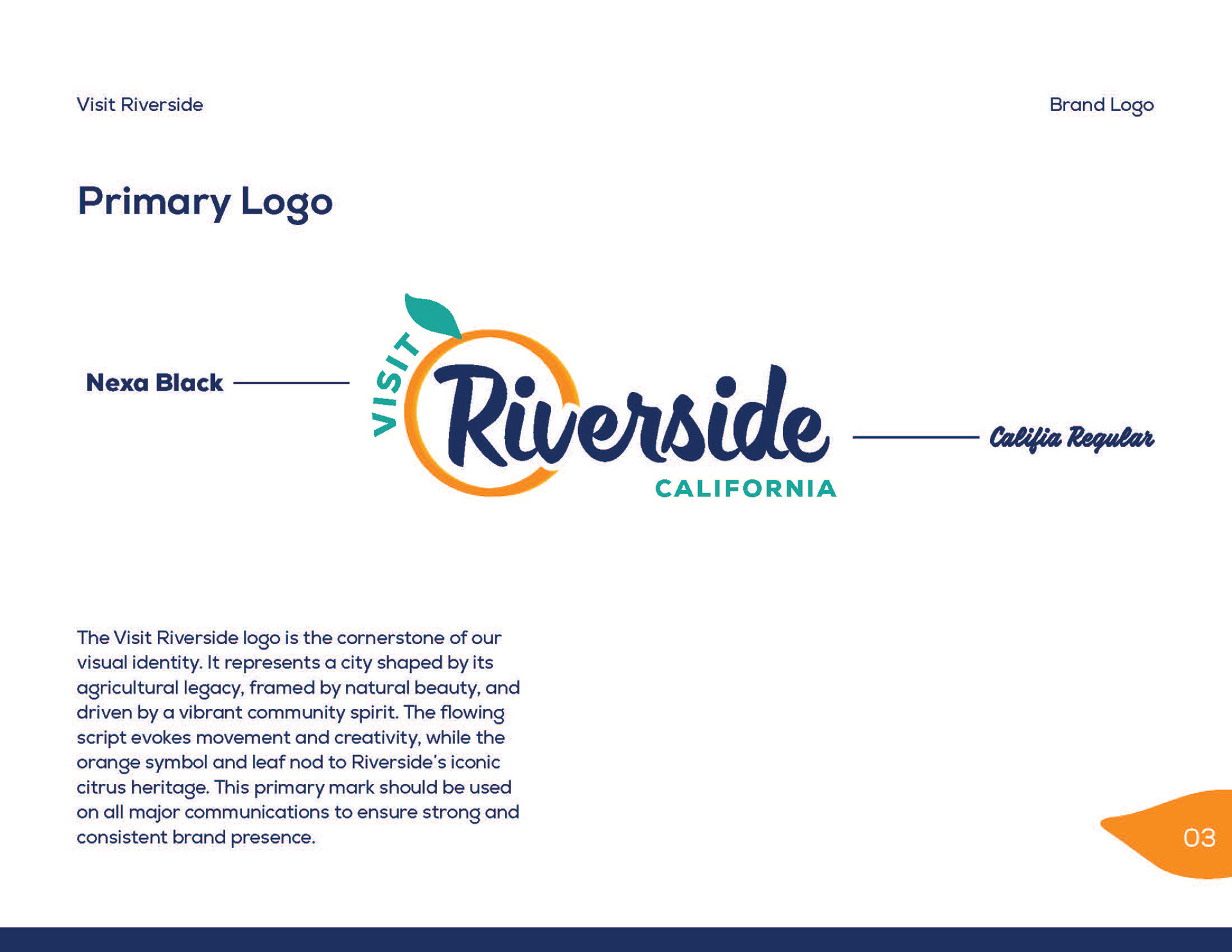
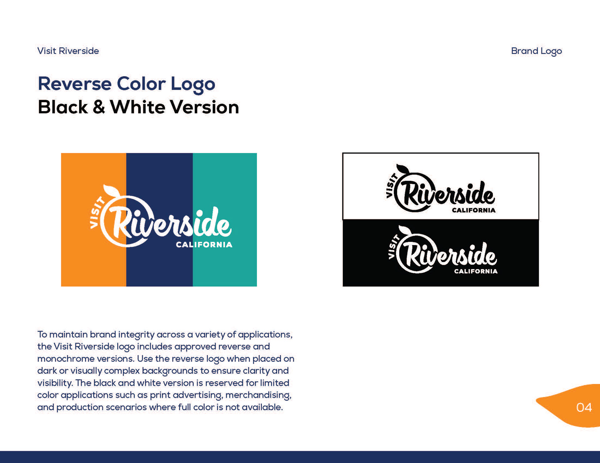
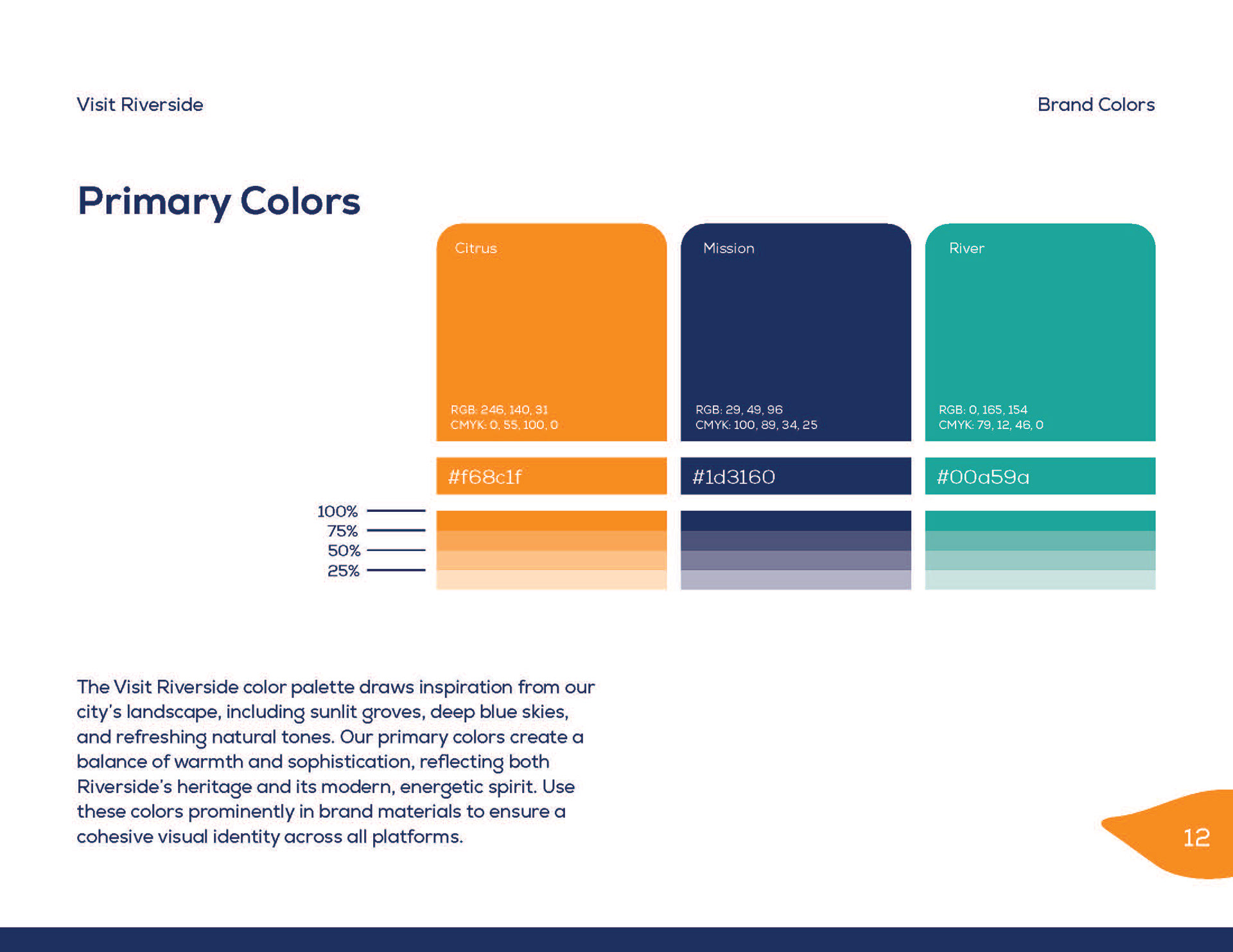
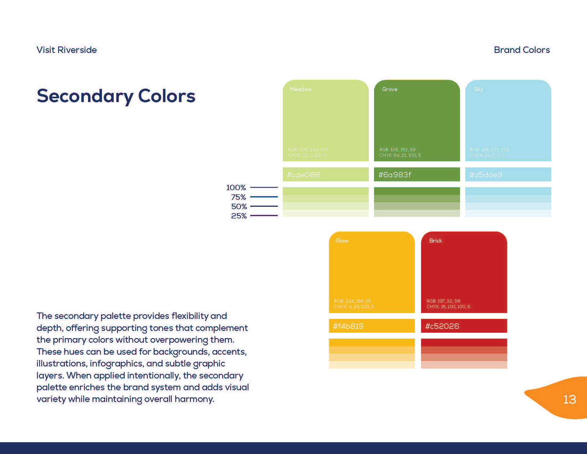
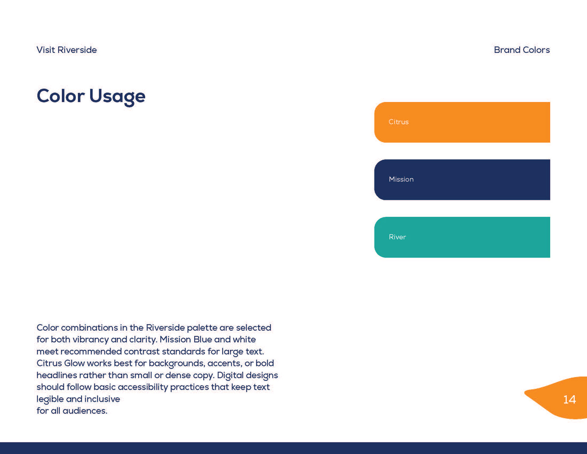
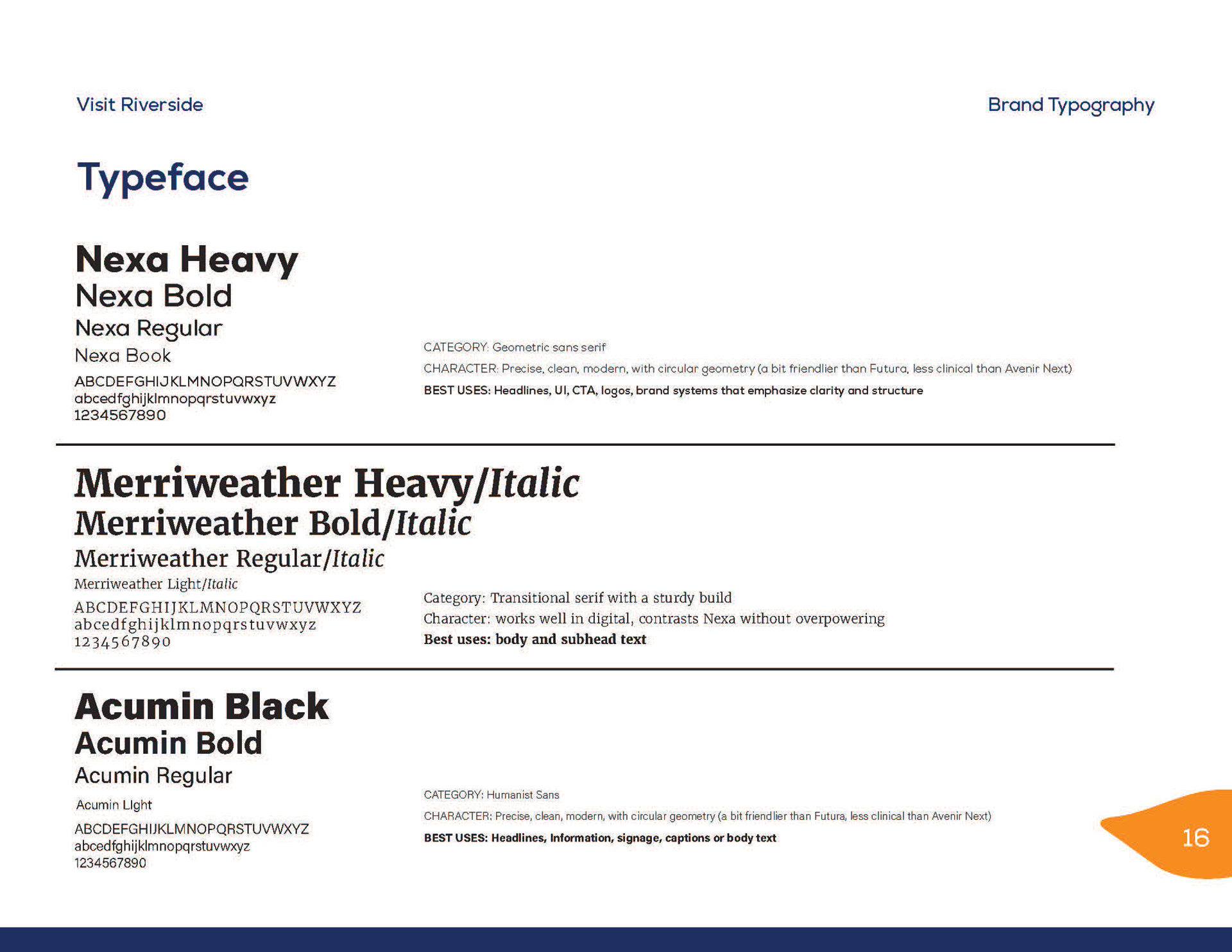
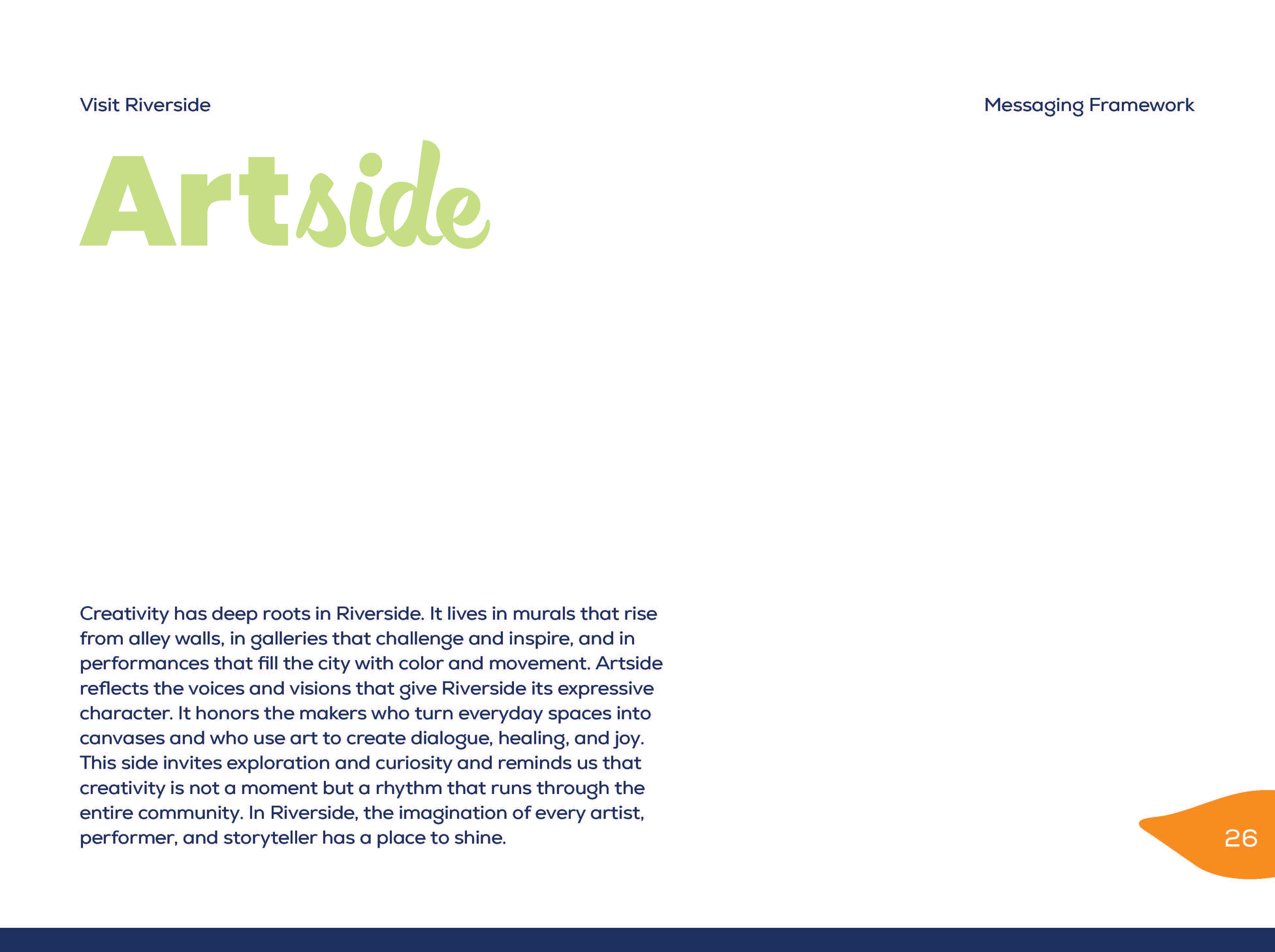
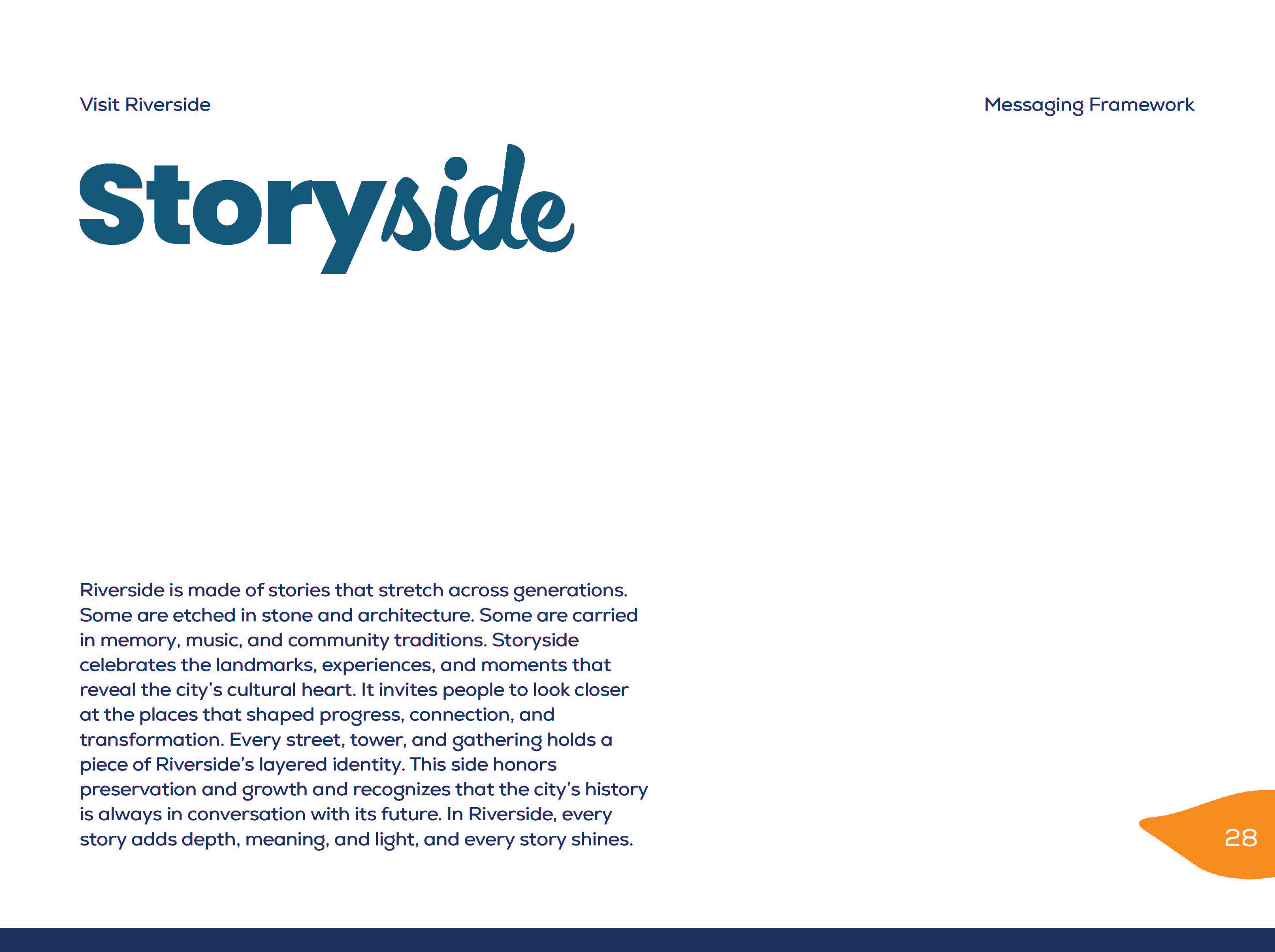
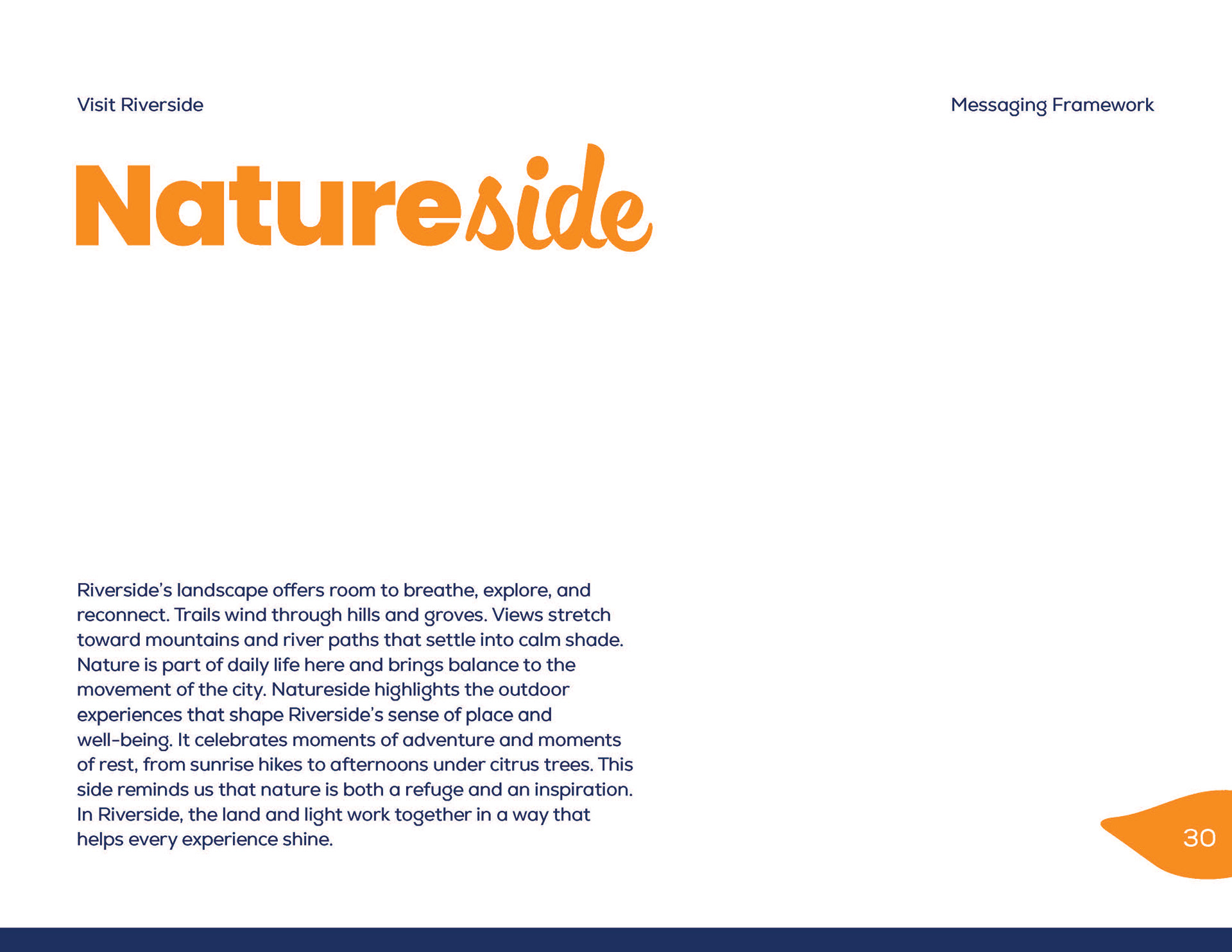
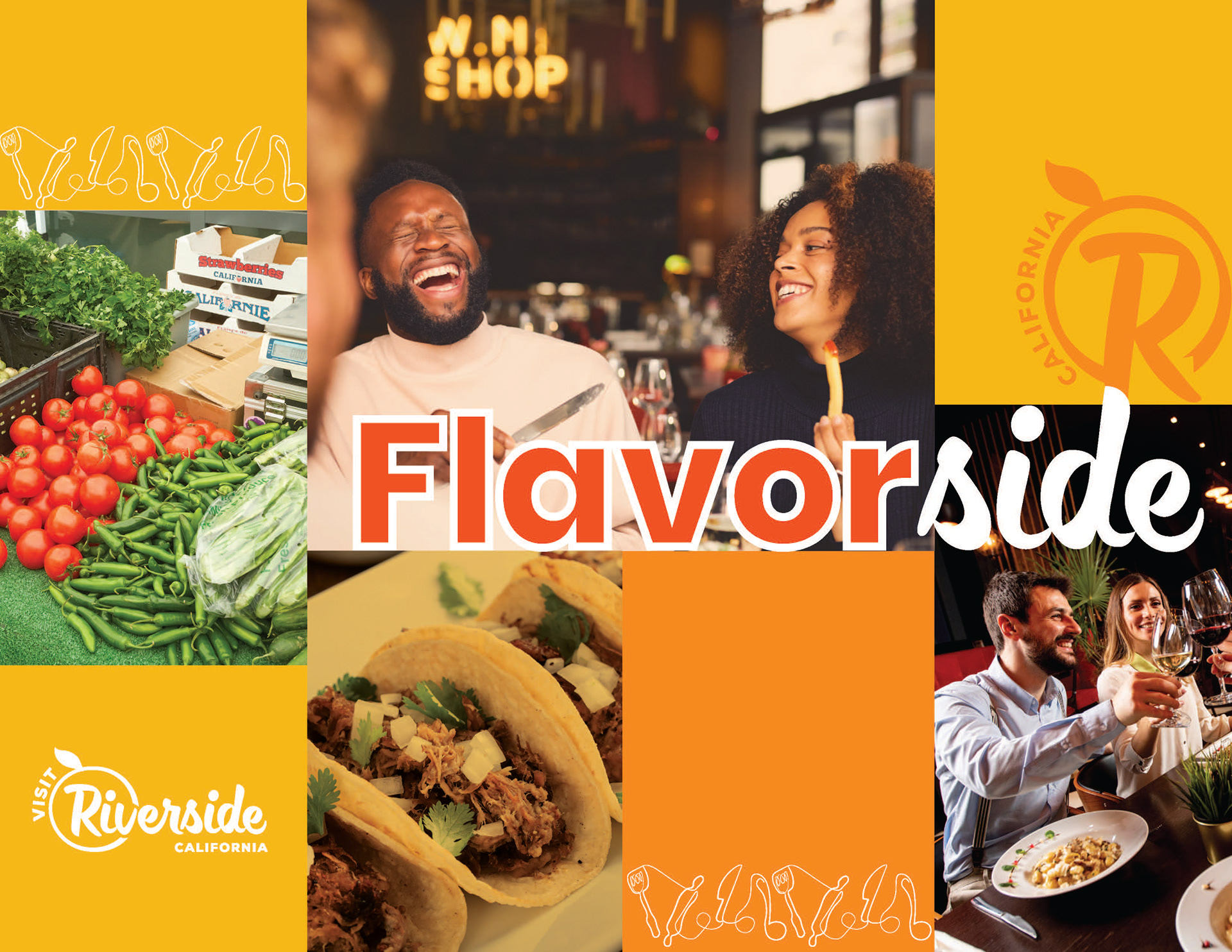
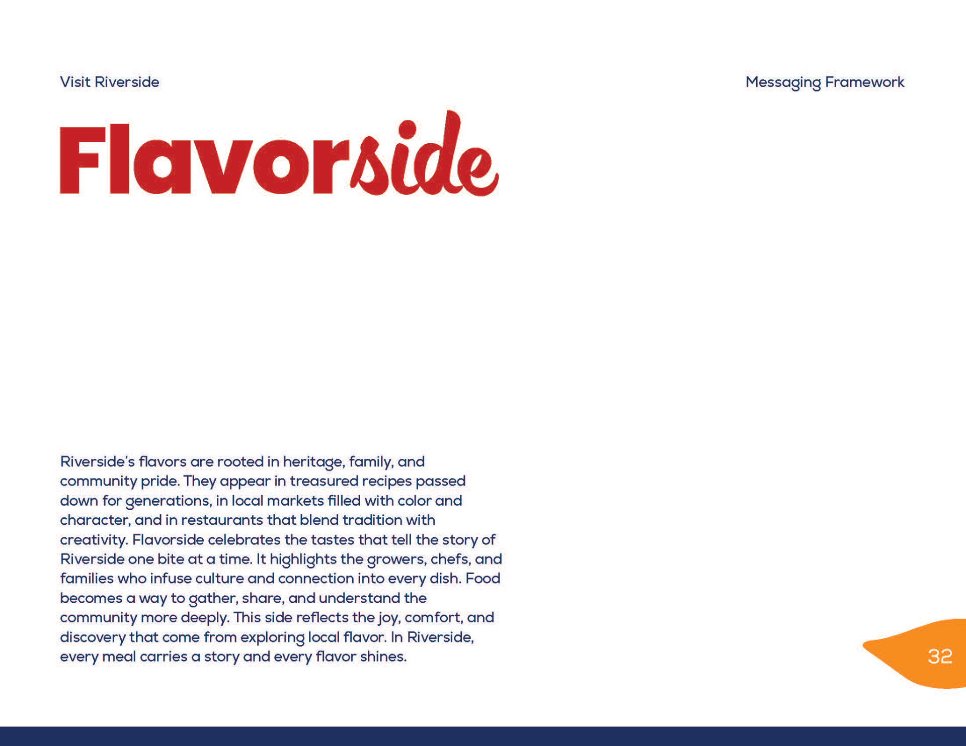
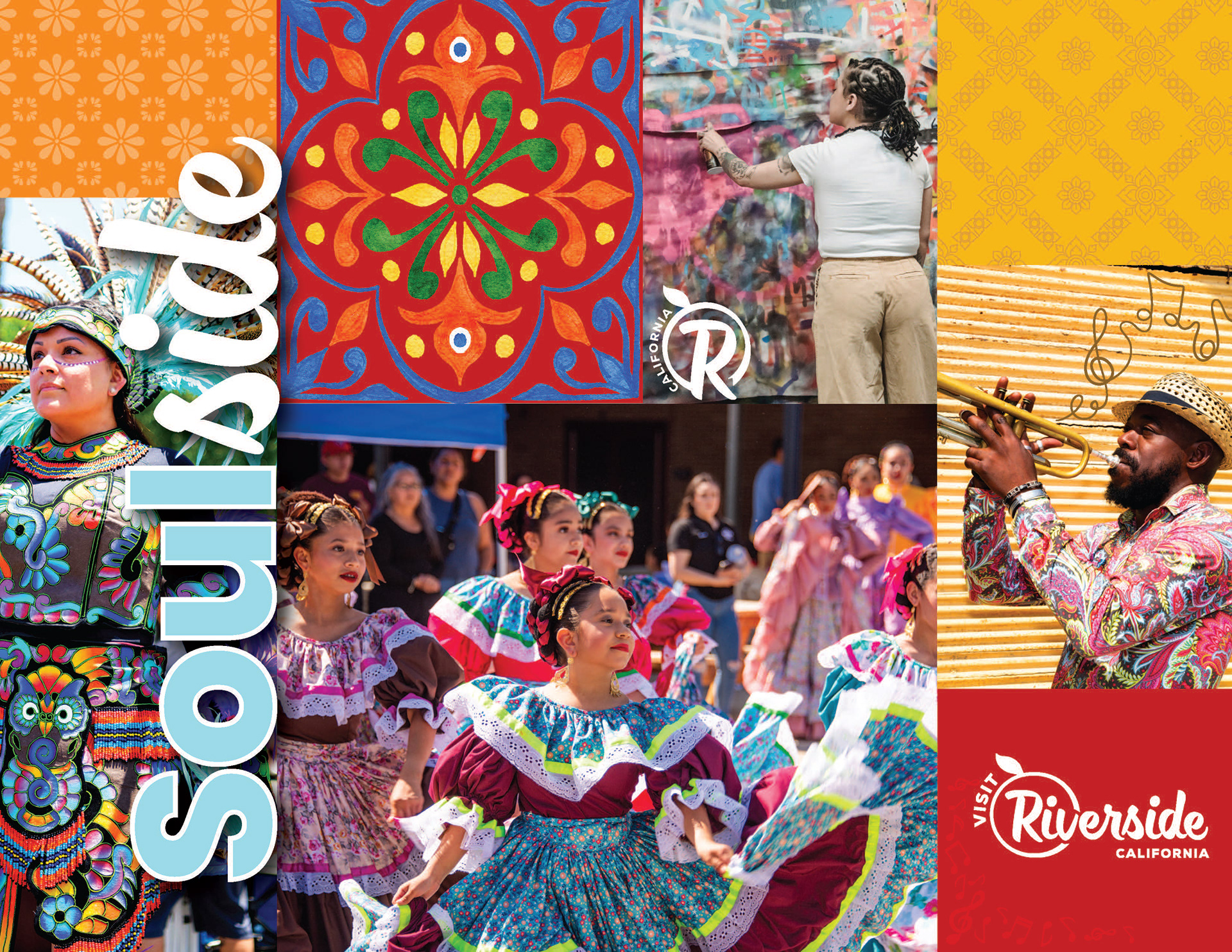
The process began with exploring Riverside’s cultural pillars, visual language, and community identity through moodboards, palette refinement, and typographic studies. I collaborated on design explorations for the refreshed “R” mark and created a pattern system inspired by Riverside’s circular motifs and agricultural history. From there, I built full brand book pages covering logo usage, color systems, typography hierarchy, graphic treatments, iconography, brand patterns, and messaging. I also developed new narrative copy, refined the brand pillars, and wrote accessible guidelines for typography, fallback fonts, pattern opacity, and CTA color usage. Throughout the project, I focused on creating a cohesive, intentional system with clear real-world application, packaged with all logo files, fonts, and brand patterns for ease of use.


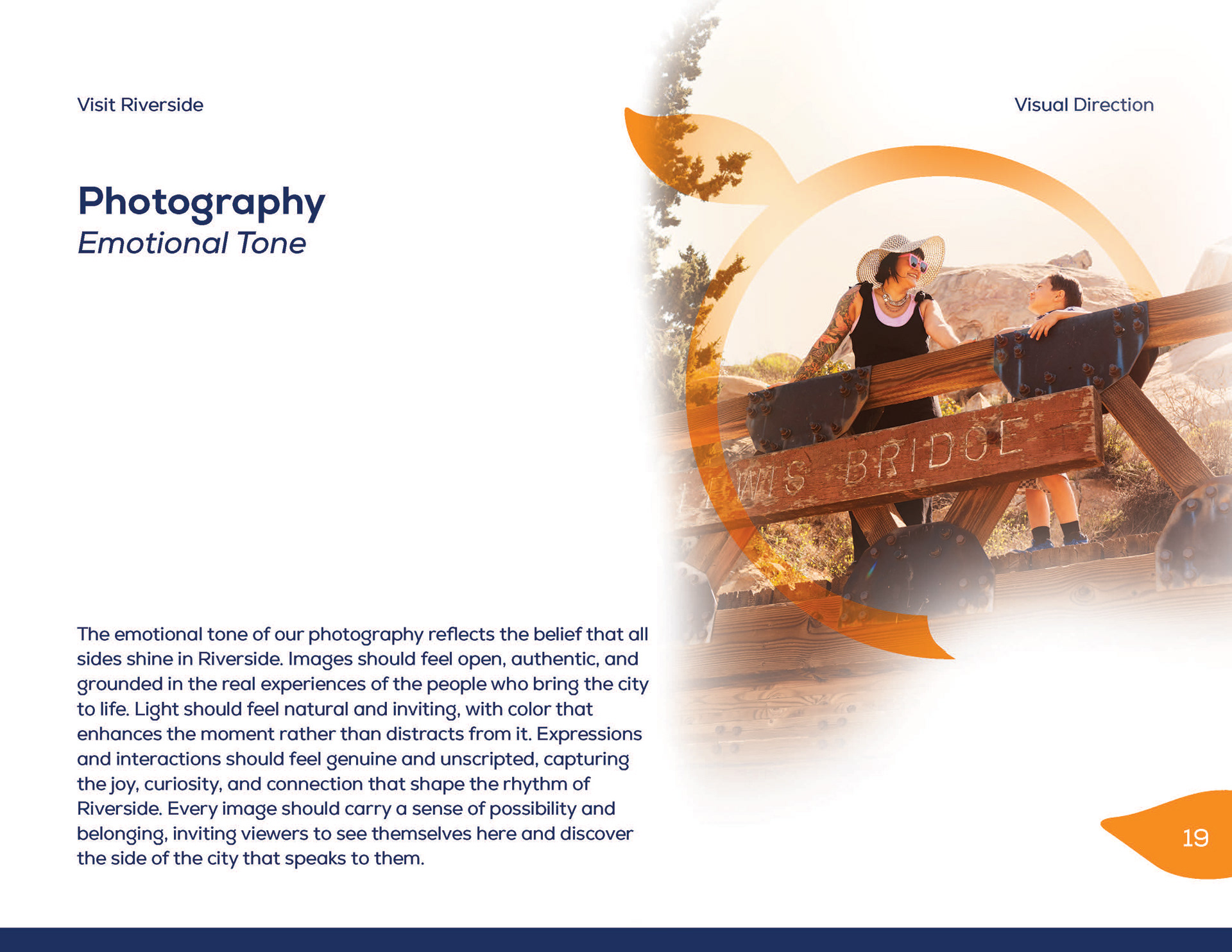
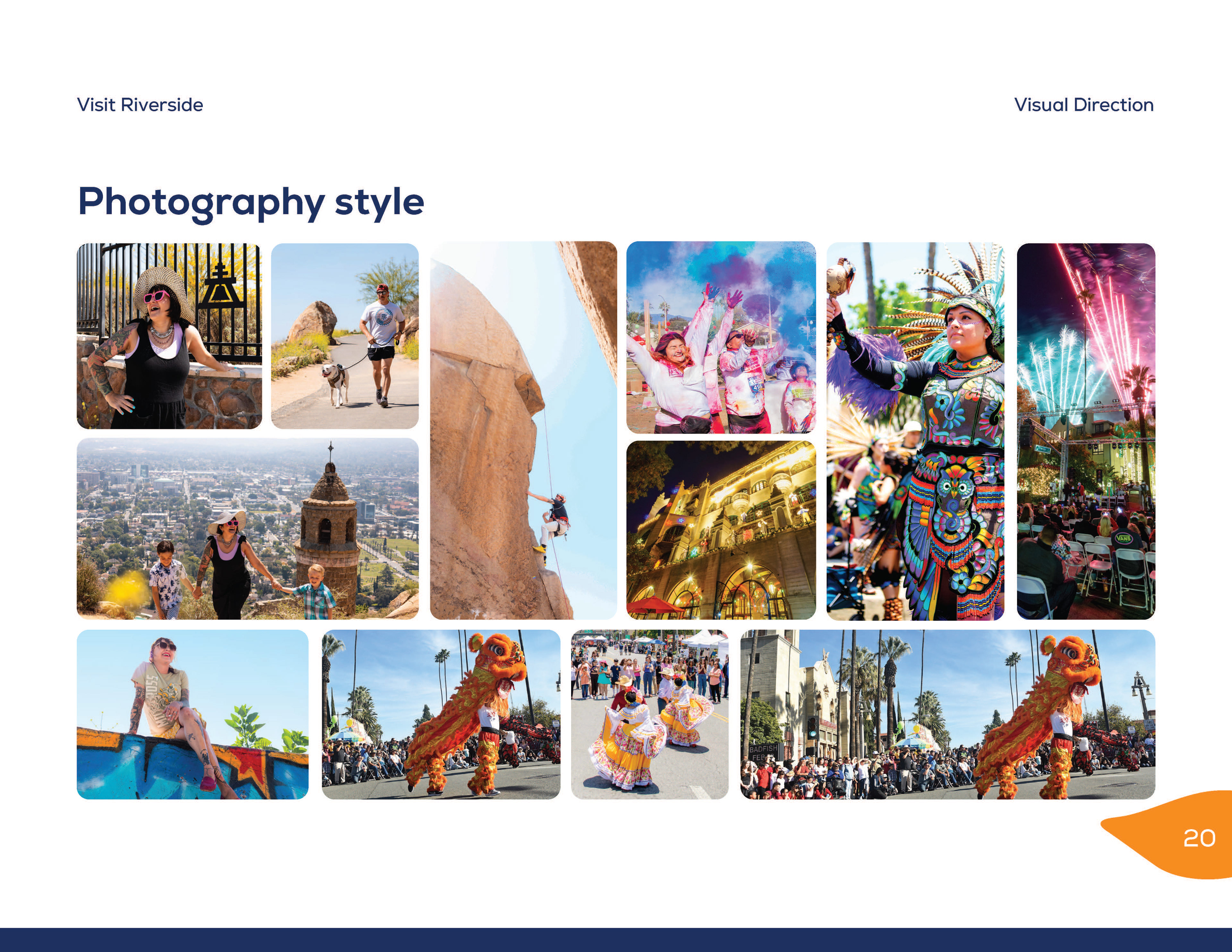
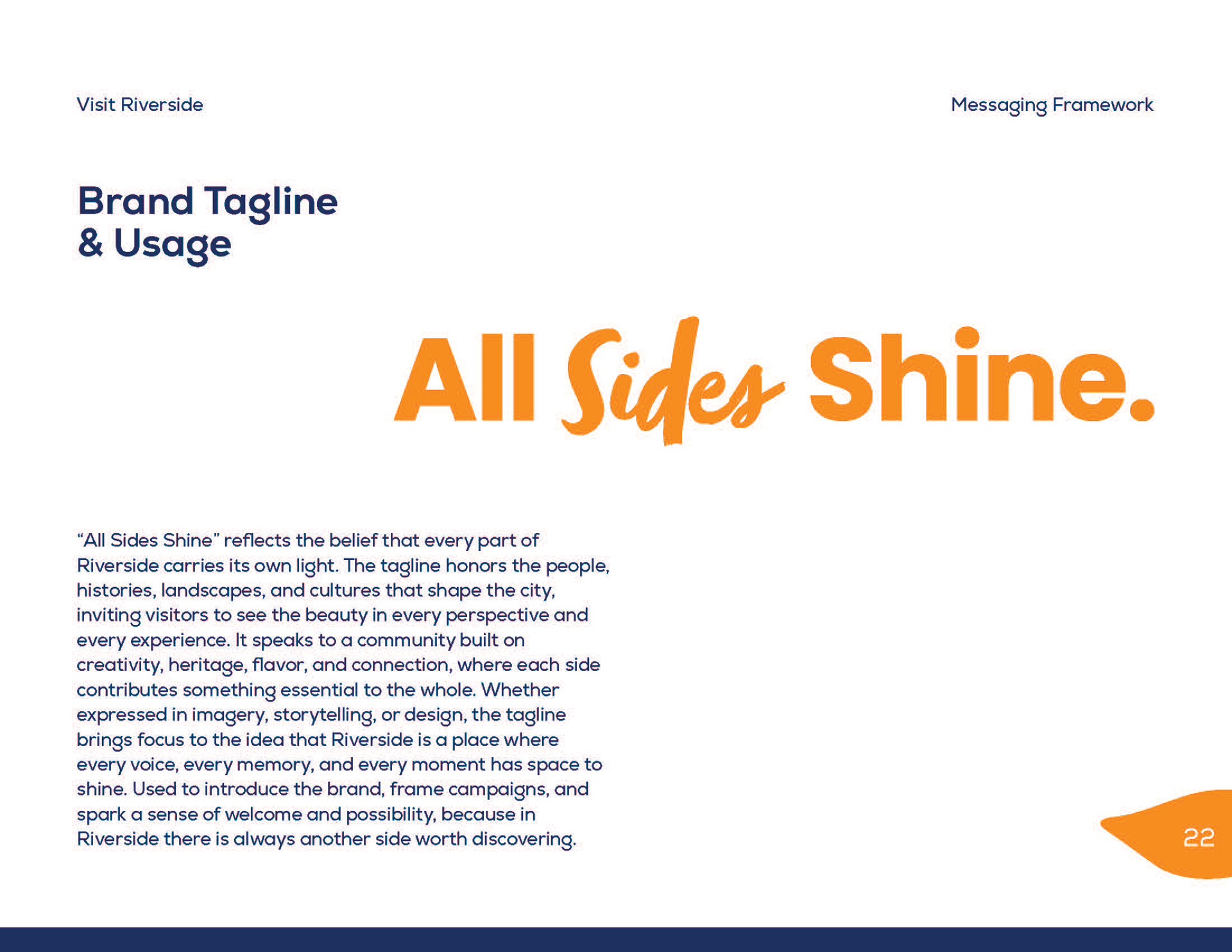
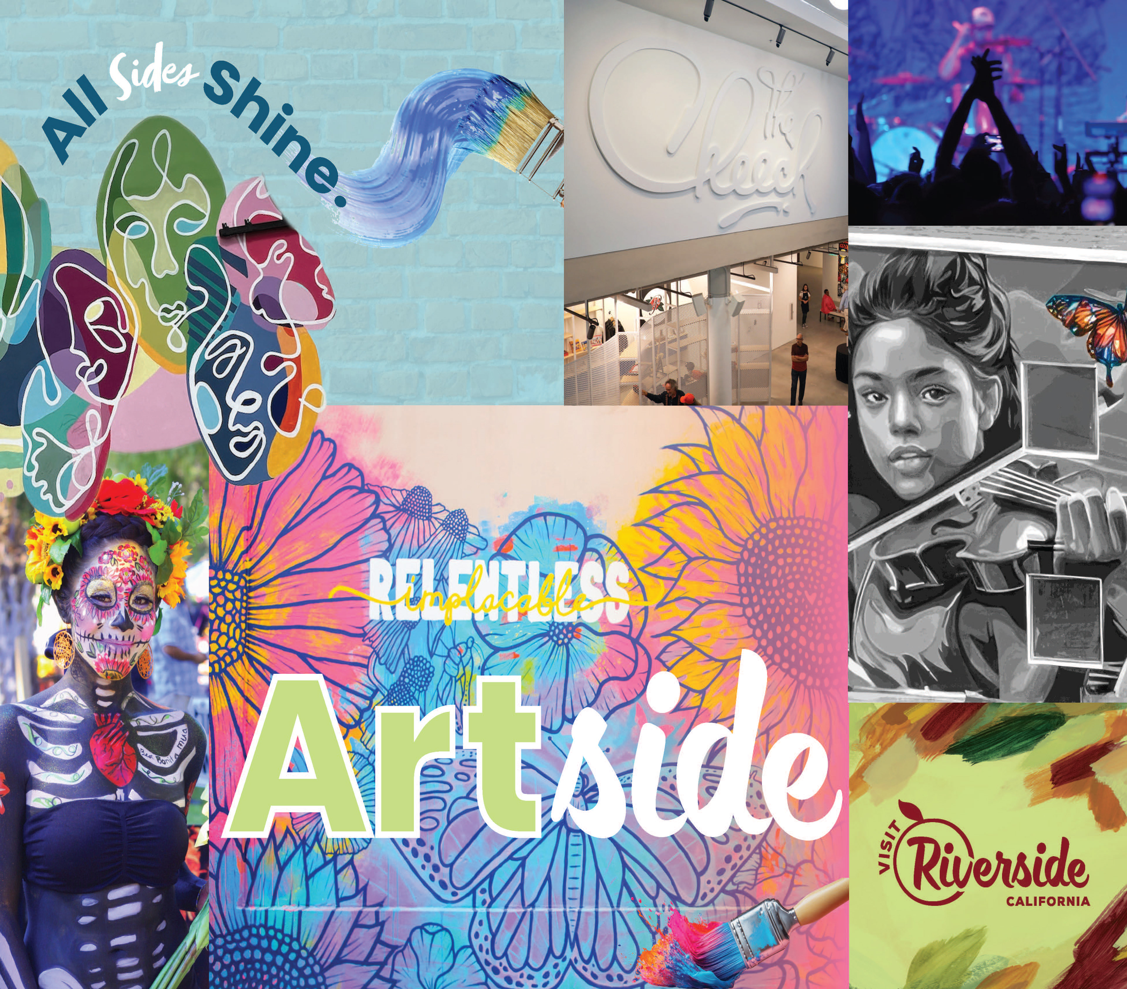
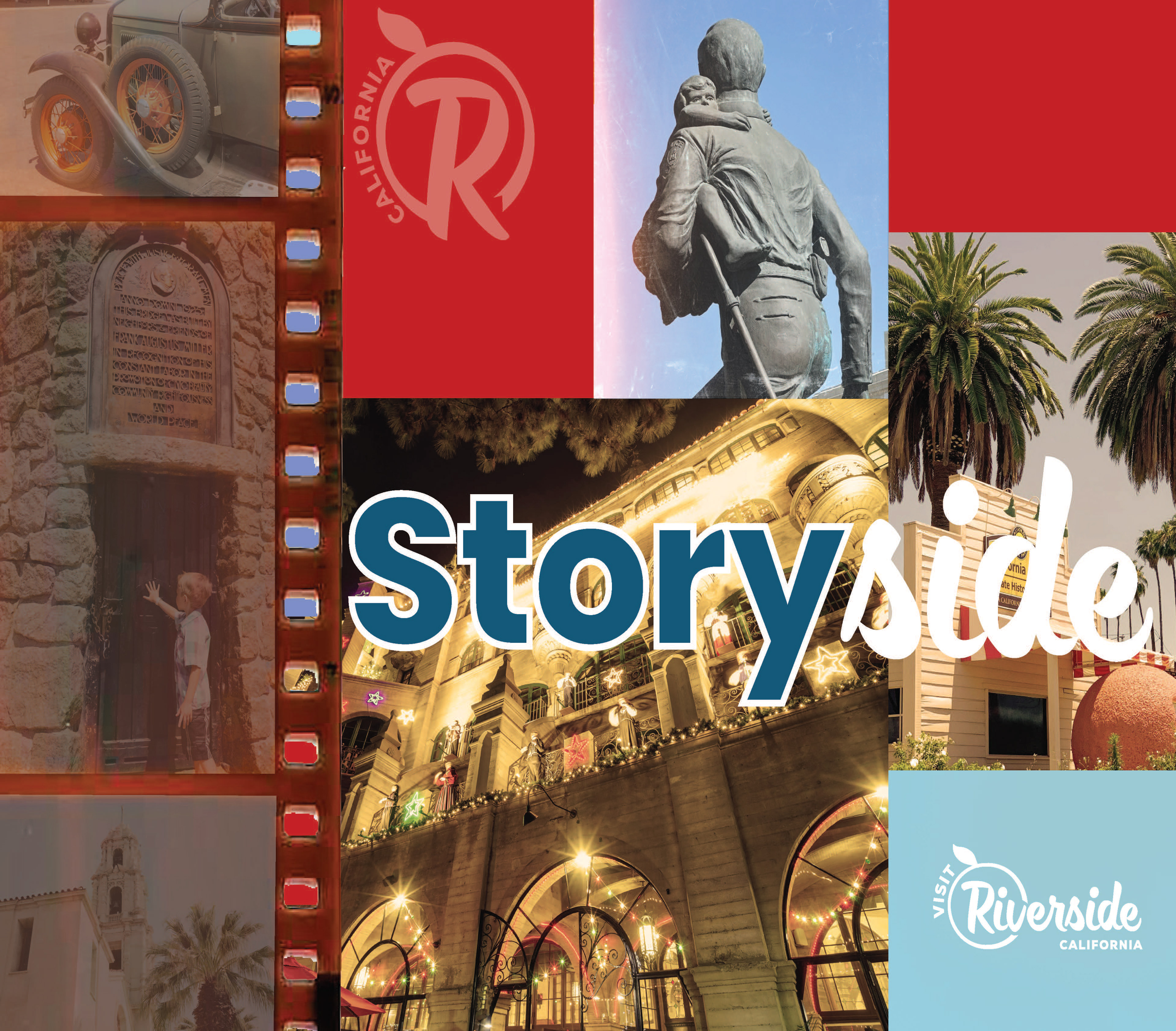
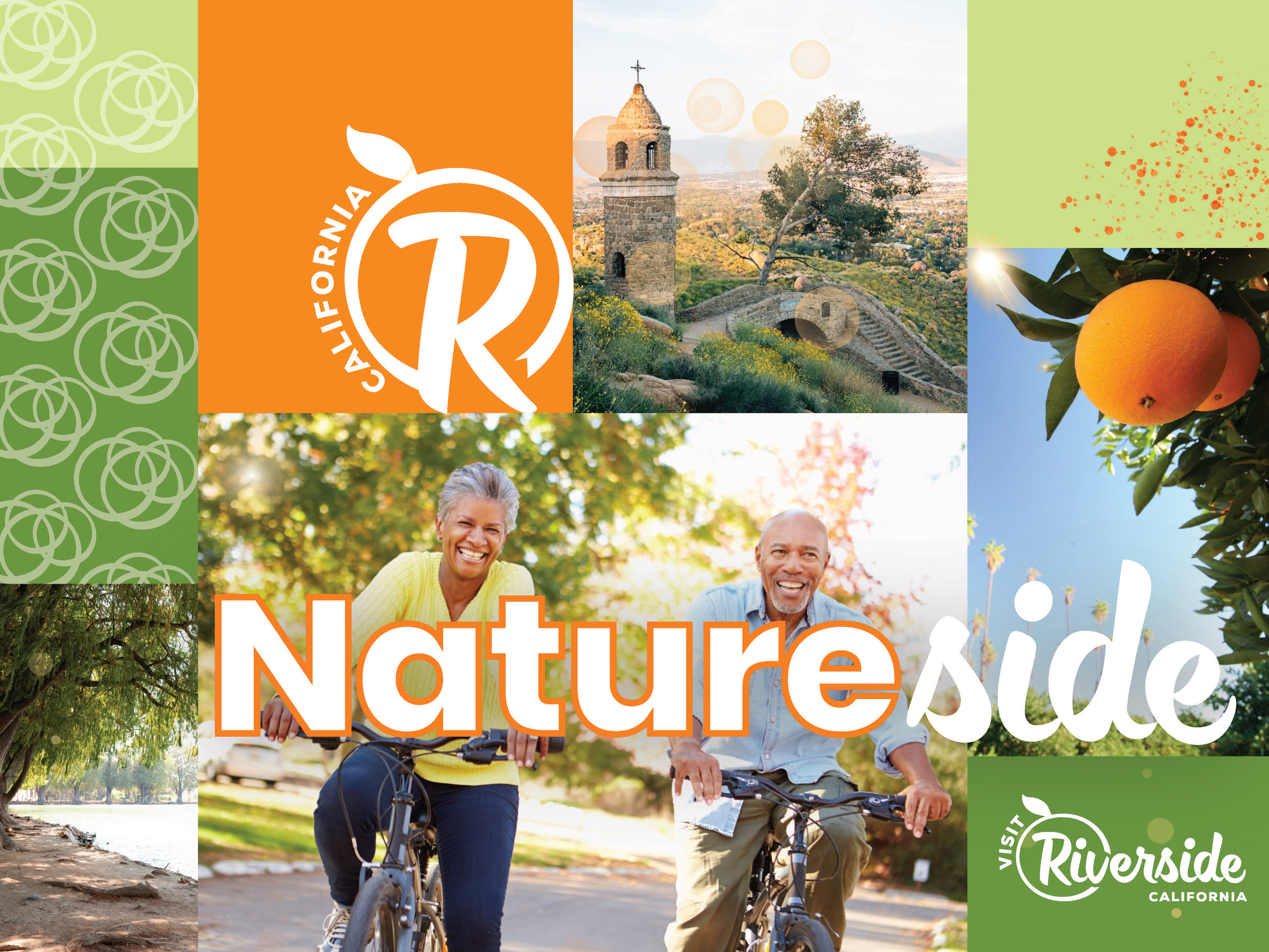
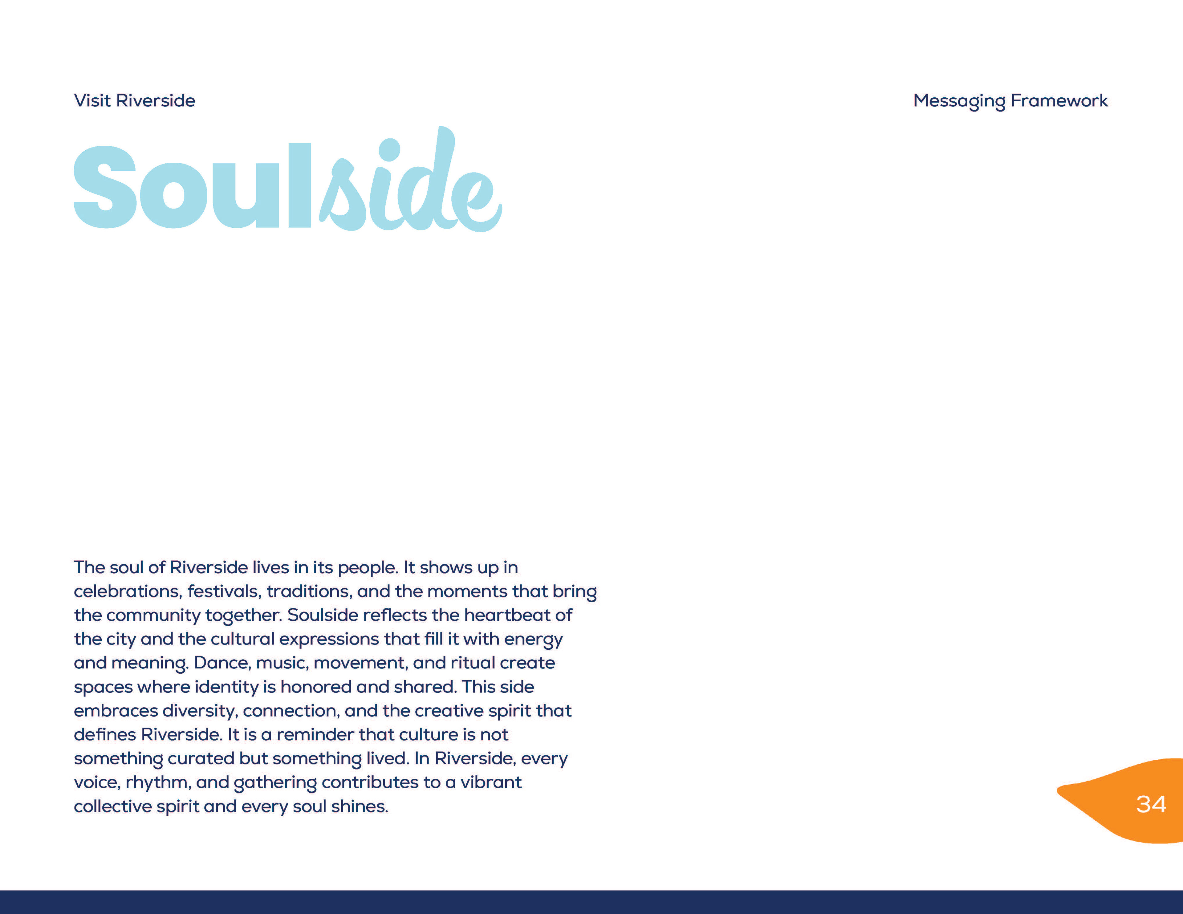
The completed Visit Riverside brand identity system presents a unified, expressive, and culturally rich representation of the city. The tagline “All Sides Shine” now sits within a full narrative framework that communicates belonging, diversity, and discovery. The new visual elements give Riverside a powerful and flexible design language, adaptable across campaigns, digital platforms, and print experiences.
The project resulted in a polished 2025 Brand Book, a clear creative strategy, and a vibrant visual identity package the city can confidently take into future storytelling, marketing, and community engagement efforts. The final system celebrates Riverside with depth, emotion, and a strong visual voice.
The project resulted in a polished 2025 Brand Book, a clear creative strategy, and a vibrant visual identity package the city can confidently take into future storytelling, marketing, and community engagement efforts. The final system celebrates Riverside with depth, emotion, and a strong visual voice.